Back to Work
[ CASE STUDY ]

THE RECIPE WAS READY. The logistics weren’t.

By JT LLC arrived through the Queens Chamber of Commerce’s Open + Online program with a name, a hand-drawn logo, and a plan to sell made-to-order Taiwanese-inspired pastries online. What it didn’t have yet was a way for an order to actually become a pickup or a delivery.

Client
By JT LLC
James Ting
Platform
Squarespace
Channel
Queens Chamber of Commerce
Open + Online Program
Services
Web Design + Brand Direction
Order & Fulfillment Strategy
Directional Copy
PART 01 // THE PROBLEM

A finished product. No way yet to get it into anyone’s hands.

James came to the Open + Online program with a fully formed sense of what he wanted to bake and sell: made-to-order canelés, snowflake crisp, and pound cake, inspired by Taiwanese flavors, under a hand-illustrated logo of a hand holding a small, strange, wonderful character. What he didn’t have yet was the business behind the bakes.

A made-to-order bakery with no defined path from order to handoff isn’t a design problem. It’s a business that can’t open yet.

  • × No business phone or social presence to build trust before a first order.
  • × No product photography — the closest thing to proof was a description.
  • × A decorative-arts line that existed as an idea, not an inventory.
  • × A fulfillment plan that was two sentences long: pickup on weekends, shipping in-state. No locations, no windows, no cutoffs, no capacity.
STARTING POINT // NO EXISTING SITE

Only assets at intake: a completed design questionnaire and one provided logo file. No prior site to redesign — everything below was built from a blank slate.

PART 02 // THE SHIFT

Build the ordering system that didn’t exist yet.

Instead of publishing a fulfillment page that just repeated what James had said (pickup weekends, shipping in New York State), we proposed a working operating system and let him choose inside it — his call on every real decision, our job to make sure every option actually worked.

01
Pickup Zones, Not a Vague Weekend

[JACKIE-PROPOSED → AGREED]
Two pickup days, one per borough, so a single person could work a subway line instead of driving cross-borough. James chose Saturday in Manhattan, Sunday in Queens from the options offered.

02
A Window That Matched the Subway, Not the Calendar

[AGREED, CLIENT-INITIATED]
Proposed a 2-hour pickup window per location; James countered with 1 hour, closer to how fast someone could actually move between stops. That became the spec.

03
Cutoffs and Caps Tied to a Real Kitchen

Sunday 11:59pm EST cutoff for the following week. Daily production caps wired to inventory — 20 canelés, 10 packs snowflake crisp, 2 loaves pound cake — so the site can never promise more than one kitchen can bake.

04
The Cutoff, on the Homepage — Not in an Email

A three-step explainer (Order / Create / Enjoy) plus an "Important Dates" block, so a first-time visitor sees the cutoff and pickup days before they ever add something to cart.

The rest of the build had to solve for the same problem in different rooms of the site. The decorative-arts line had no sellable inventory yet, so instead of a product grid it became a hybrid: a landing page on artistic philosophy, a portfolio gallery, an available-prints shop, and a commission inquiry form — a structure that works with zero pieces on day one. With no product photography and a client who preferred illustration anyway, the visual direction leaned into line-drawing motifs: a Taiwan island silhouette, mountain lines, a tea leaf, Chinese characters as background texture. And because "Headline Here" doesn’t tell you if an eyebrow line is too long, directional copy — always framed to James as editable — carried every hierarchy and pacing decision on the site, from the About page down to the FAQ.

Homepage, desktop — full-page scroll capture
Homepage, mobile — full-page scroll capture
About, mobile — full-page scroll capture
About, desktop — full-page scroll capture
PRODUCT PAGE — DETAIL AS THE FEATURE

The product page is doing work most Open + Online sites skip: lead times, minimum orders, customization rules, storage instructions, and full allergen disclosure, all built into an accordion by flavor so it never crowds the product itself. It’s the same information a contact-page FAQ would otherwise have to carry — surfaced at the moment it’s actually needed, before checkout, not after.
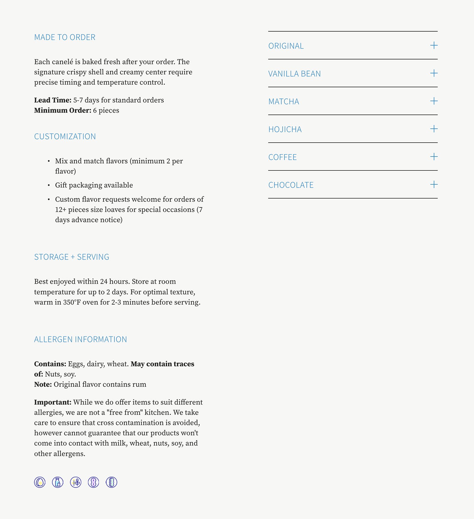
Product page, desktop — full-page scroll capture
By JT product page detail callout — customization options and allergen accordion by flavor
Product page, detail callout — customization and allergen accordion
PART 04 // TAKEAWAY

The lesson every made-to-order business needs to hear.

“A beautiful site with no defined fulfillment path loses the sale.”

Every small business that sells something made-to-order hits the same wall eventually: the site can describe the product beautifully and still lose the sale at the exact moment someone tries to figure out how they’ll actually get it. Cutoffs, capacity, pickup logistics — these aren’t details to sort out after launch. They’re the difference between a site that takes orders and a site that just describes them.

For By JT, that meant building the operating system before writing a line of homepage copy: real pickup windows tied to a real subway map, a cutoff date built into the site instead of buried in an email, daily caps that matched what one kitchen could actually produce. None of it was contracted work. All of it was the difference between a beautiful bakery site and one a customer could actually use.

[ SOUND FAMILIAR? ]

Selling something made-to-order?

Same problem, different kitchen. Most sites like this aren’t broken — they’re just missing the system behind the “order now” button. Let’s find out where yours stands.